Cracking the Code: Understanding the CSS Box Model
Welcome, intrepid coders! Today, we’re embarking on a journey to unravel one of the mysteries of the web design realm—the enigmatic CSS Box Model. Buckle up your style sheets, and let’s dive into the world of pixels, margins, borders, and padding!
The CSS Box Model Demystified
In the realm of web design, every element on your page is like a tiny box. Picture it as a gift waiting to be unwrapped. Now, this box has four layers: Content, Padding, Border, and Margin. It’s like a nesting doll, but for the web!
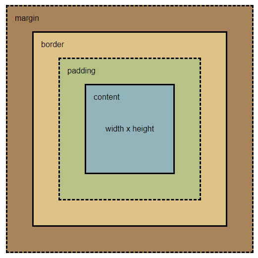
- Content: The Heart of the Matter
The innermost layer is the content. It holds the actual content of your element—text, images, videos, or whatever else your creativity conjures. This is where the real magic happens! - Padding: Like a Warm Hug
Right around the content, we have the padding. Think of it as a cozy cushion hugging your content. Padding is the space between the content and the border, ensuring your element doesn’t feel cramped. - Border: Defining Boundaries
The next layer is the border. It’s like the wrapping paper around your gift, defining the boundaries of your element. You can style it, color it, and give your element a distinctive personality. - Margin: Giving Breathing Room
Last but not least, we have the margin. This is like the personal space around your element, ensuring it doesn’t invade the space of its neighboring elements. Margin gives your design balance and prevents elements from getting too cozy with each other.
Box-Sizing Property: Redefining the Rules
Now, let’s talk about a game-changer—the box-sizing property. By default, the total width of an element is calculated as width + padding + border. But what if you want a different calculation method?
You have the power to redefine the rules! Setting box-sizing: border-box; includes padding and border in the element’s total width. This means you can change the width of an element without worrying about the padding and border throwing off your measurements.
Here’s how you can use it:
.my-element {
  box-sizing: border-box;
  width: 200px;
  padding: 20px;
  border: 2px solid #3498db;
  margin: 10px;
}
Now, the total space calculation considers padding and border within the specified width, providing a more intuitive way to size your elements. Note that, whatever value you set to box-sizing, the margins will never be part of an element’s width as it’s outside of it. The default value for box-sizing is content-box, of course you don’t need it to set it yourself for every element, the browser does it for you.
Putting It All Together
Now that we’ve unwrapped our CSS gift, let’s see it in action. Let’s take our previous example and imagine you apply it to a div with a class:
.my-element {
  box-sizing: border-box;
  width: 200px;
  padding: 20px;
  border: 2px solid #3498db;
  margin: 10px;
}
The total space this div occupies on the page is 200px, meaning our content has a width of 156px (200px - 2(20px) - 2(2px)) (remember that margins are added outside the element). Now, what would be the element’s width if our box-sizing had its default value?
Total width = width + 2(padding) + 2(border)That would give us:
Total width = 200px + 2(20px) + 2(2px) = 244pxWhy Does It Matter?
Understanding the box model and the box-sizing property is crucial for precise and pixel-perfect layouts. It gives you the flexibility to control how the size of an element is calculated, ensuring your design looks the way you envision it.
Conclusion
Congratulations, brave coder! You’ve conquered the CSS Box Model and unlocked the secrets of box-sizing. Remember, it’s not just about boxes and pixels; it’s about giving your web creations the space and style they deserve. Stay tuned for more coding adventures, and may your pixels always align! 🚀✨
Photo of Luke Heibert on Unsplash